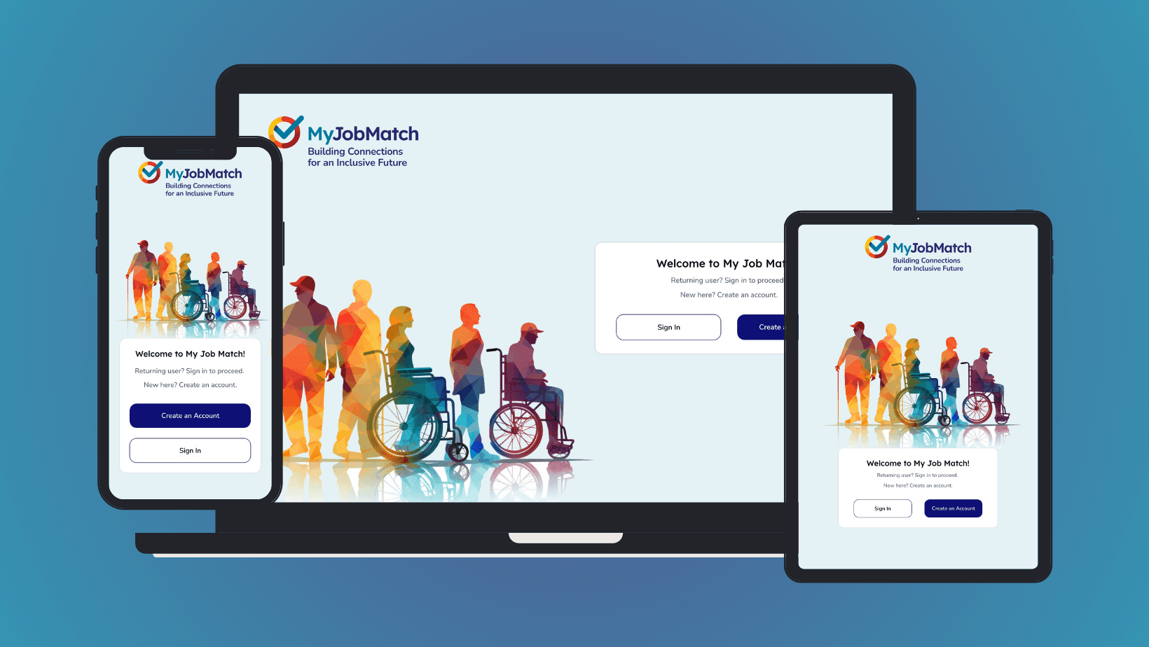
Product Design of MyJobMatch B2C Platform
MyJobMatch B2C is an innovative SaaS platform tailored for individuals with intellectual and developmental disabilities. It bridges the gap between these job seekers and potential employers, ensuring a more inclusive and supportive job search experience. The platform's inception was rooted in the success of its B2B counterpart, which catered to employment support professionals. This B2C iteration aims to empower job seekers directly, granting them access to a vast network of job opportunities and professional support.
Product Owners
Government of Ontario
Community Living Toronto
Placemaking 4G
Project Date
2023
Human Resources
Ontario, Canada
Challenge
The primary challenge was to transform MyJobMatch into a two-sided platform. On one side, job seekers could build profiles and express interest in job opportunities. Conversely, employment support professionals could collaborate to create, match, and secure these opportunities. The goal was to design a platform that was not only user-friendly but also addressed the unique needs and challenges faced by individuals with intellectual and developmental disabilities.
Roles & Responsibilities
As the sole UX and Product Designer, I was responsible for understanding user needs, designing user interfaces, and ensuring the platform's usability and accessibility. I collaborated closely with a remote team comprising a product manager and three developers.
Team Dynamics:
Our team operated remotely, which required effective communication tools and regular check-ins. Collaborating with stakeholders, including government officials and the leadership of Community Living Toronto (CLTO), was crucial. Their insights and feedback were invaluable in shaping the platform's direction and ensuring its alignment with the broader objectives of supporting job seekers with disabilities.
Results
80%
User satisfaction rate
25%
Increase in profile completion
15%
Increase in user engagement
“We're all incredibly impressed. Thank you for your care and attention to detail.”

Holly Dickinson
Project Manager | Placemaking 4G
Process and What I Did
Initial Research & Discovery:
What I did: To kick off the design process, I began with a series of interviews with individuals with disabilities to gather firsthand insights.
Why: Direct user feedback is the cornerstone of user-centered design, ensuring the product addresses genuine needs.
Result: A rich dataset that formed the foundation for subsequent design stages and highlighted the need for a familiar design pattern.
Learnings: Never assume; always validate user needs directly from the source.
User Personas:
What I did: Developed detailed user personas based on interviews with individuals with disabilities.
Why: Understanding our users is a fundamental UX principle. By creating detailed personas, I understood the unique needs, preferences, and challenges of the primary users.
Result: A clear representation of the target users, guiding the design process.
Learnings: Personas provide a tangible reference point, ensuring the design remains user-centric.
User Personas Document Developed :
User Scenarios to User Goals:
What I did: Crafted user scenarios from personas, then distilled these into user goals.
Why: Scenarios and goals provide context, ensuring the design addresses real-world user situations.
Result: A structured framework guiding feature and functionality development.
Learnings: Contextualizing user interactions ensures the platform remains relevant and valuable.
Translating User Goals to Features:
What I did: Translated user goals into actionable platform features.
Why: Aligning features with goals ensures every platform element has a purpose rooted in user needs.
Result: A feature set that directly caters to user objectives.
Learnings: Purpose-driven design enhances user satisfaction and platform efficiency.
Wireframing:
What I did: Created low-fidelity wireframes to visualize the platform's structure and layout.
Why: Wireframing is a crucial step in the UX process. It provide a skeletal framework, ensuring a logical flow and hierarchy in the design.
Result: A visual blueprint that informed the design's evolution.
Learnings: Early visualization is key to spotting potential design challenges and opportunities.
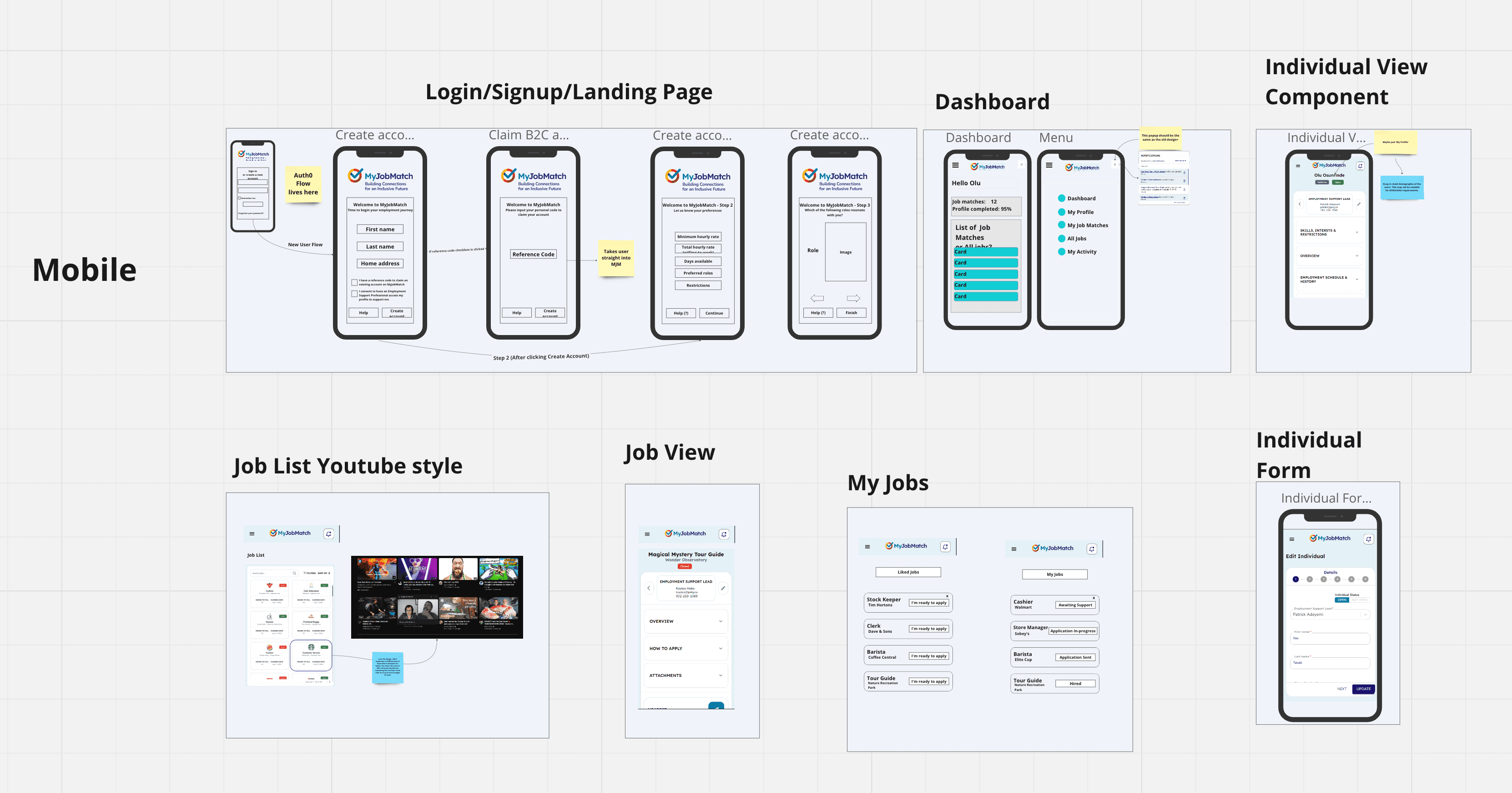
Low-fiidelity wireframes on miro board
Prototyping:
What I did: Crafted interactive prototypes, refining them based on feedback and design principles.
Why: Prototypes simulate the final user experience, allowing for iterative testing and refinement.
Result: A tangible, interactive representation of the platform for user testing.
Learnings: Prototyping is essential for validating design decisions before development.
User Testing:
What I did: Conducted comprehensive user testing sessions with the primary users, individuals with disabilities. This involved presenting them with the platform's prototypes, observing their interactions, gathering feedback, and noting areas of friction or confusion.
Why: User testing is a fundamental UX principle to validate design decisions and ensure the product meets user needs and expectations. Especially for a platform like MyJobMatch B2C, where the user base has specific requirements, it's crucial to ensure the design is functional, intuitive and accessible.
Result: The feedback from user testing was invaluable. It provided concrete data that showcased the platform's strengths and highlighted areas for improvement. For instance, the positive reception of the benchmark design approach, inspired by familiar platforms like YouTube, was a testament to its effectiveness. The data gathered also directly influenced the design results, showcasing high user satisfaction rates and confirming the platform's ease of use.
Learnings: No matter how informed design decisions are, real-world user feedback is irreplaceable. It's essential to approach user testing with an open mind, ready to adapt and refine the design based on genuine user experiences. This iterative process is critical to achieving a product that truly serves its users.
Key Design Decisions
UX Benchmark Design Methodology:
What I did: Based on user feedback, adopted familiar design patterns, drawing inspiration from platforms like YouTube.
Why: Users were already familiar with platforms like YouTube, making it a suitable benchmark to ensure ease of use. Leveraging familiar interfaces reduces the learning curve, ensuring users can navigate the platform intuitively.
Result: An engaging, user-friendly design that resonates with the target audience.
Learnings: Leveraging familiar design patterns can significantly enhance user adoption and satisfaction.
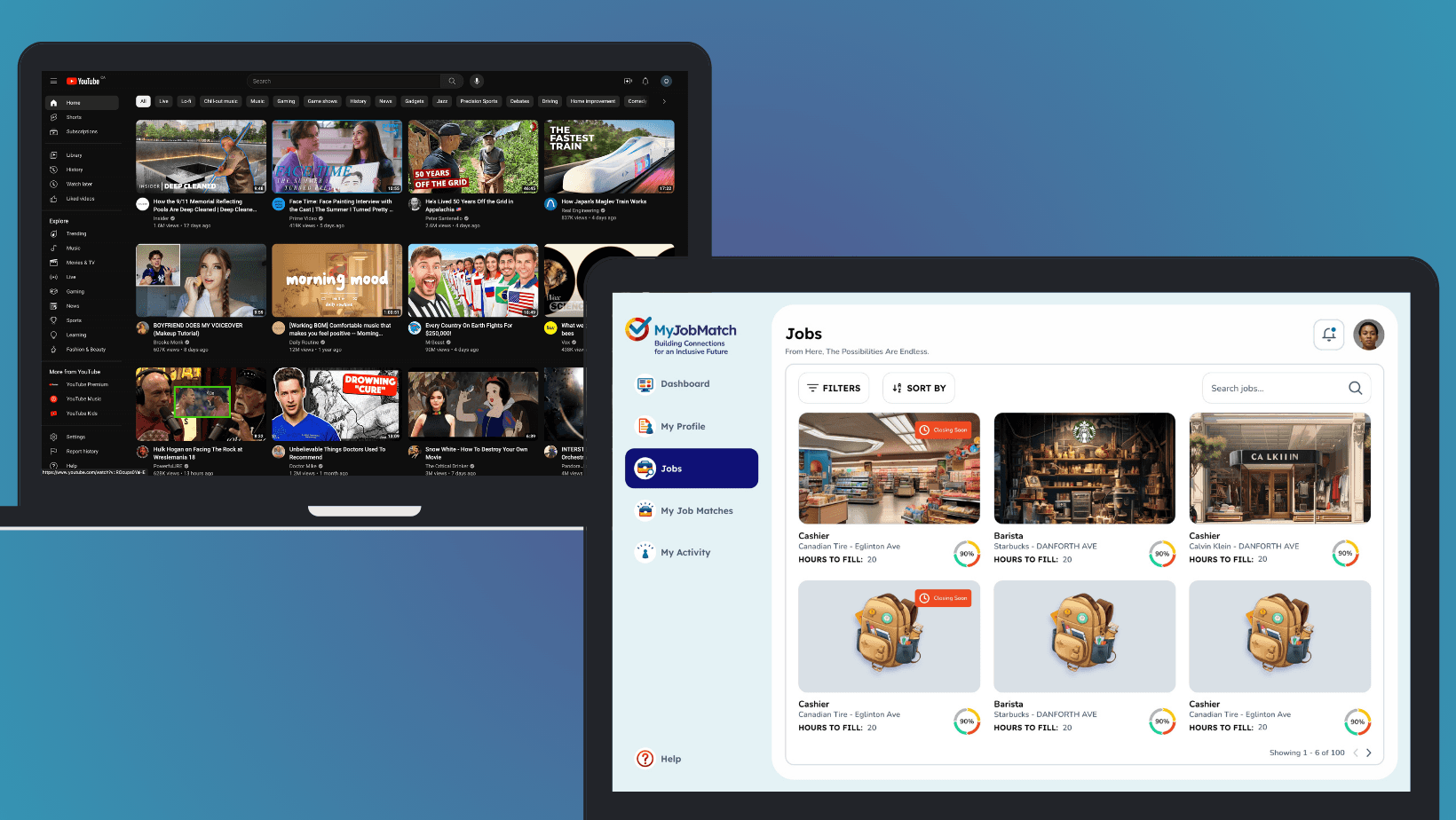
Showcasing the benchmark methodology: Youtube as an inspiration for MyJobMatch
Gamified Onboarding Experience:
What I did: Transformed the onboarding process into a gamified quiz-style experience to capture user skills and interests.
Why: Research indicated that users preferred a visually appealing platform and minimal registration work. Gamification made the process engaging and efficient.
Result: Users enjoyed the onboarding process, leading to higher profile completion rates.
Learnings: Gamification can turn mundane tasks into engaging experiences, enhancing user participation.
Quiz-style experience for generating skills and interests for user profiles
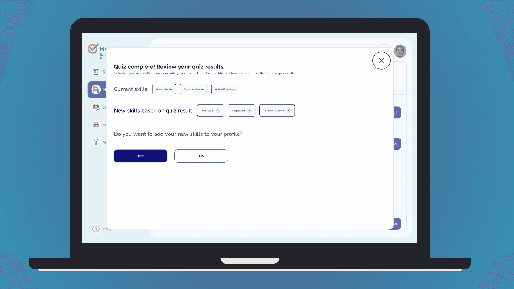
Quiz results from the 'edit profile' experience if user wants to edit skills and interests (Post onboarding)
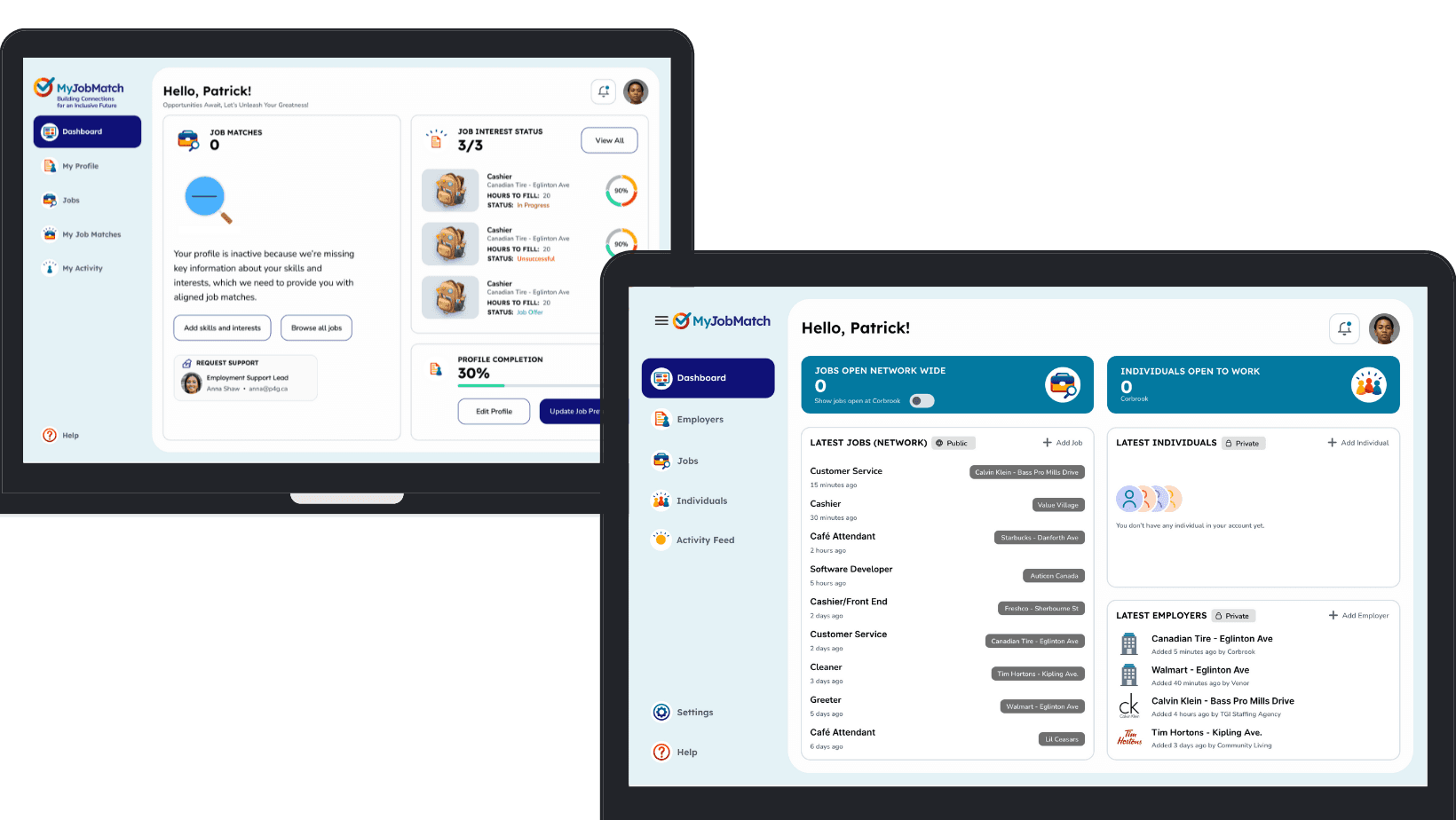
Dashboard Design:
What I did: Prioritized job matches and job status on the dashboard for maximum visibility.
Why: Direct visibility of relevant matches enhances user engagement and satisfaction.
Result: Users felt informed and in control, leading to increased platform loyalty.
Learnings: Direct visibility of key actions or information boosts user engagement.
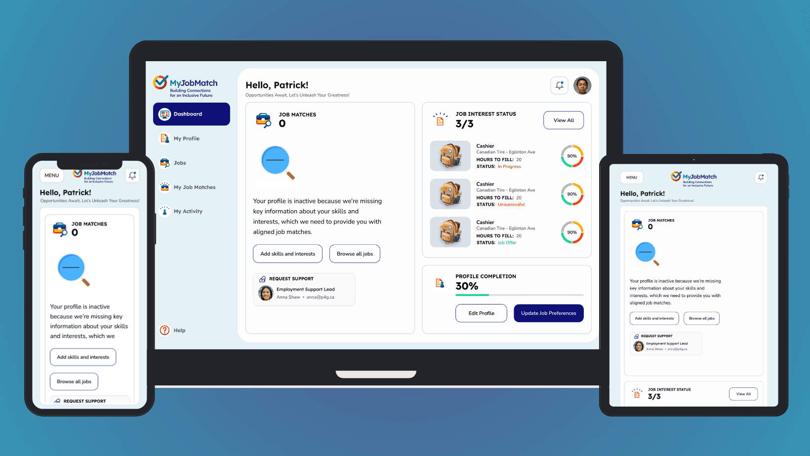
Dashboard design on mobile, desktop and tablet
Job Recommendation Matching Experience:
What I did: Developed a sophisticated job recommendation system that matches candidates to roles based on their skills and interests captured during the onboarding journey.
Why: Personalized job recommendations enhance the user experience by presenting opportunities that are genuinely relevant to the individual. By aligning job roles with a candidate's skills and interests, the platform ensures that users are presented with roles they are both qualified for and passionate about.
Result: Users experienced a tailored job search, leading to higher engagement rates and a greater likelihood of expressing interest in roles that genuinely resonate with them. This precision in matching also meant employers received interest from candidates who were a better fit for their roles, streamlining the hiring process.
Learnings: Personalization, driven by accurate user data, creates a meaningful and efficient job search experience. The more aligned a recommendation system is with a user's genuine skills and interests, the more successful the platform becomes in fulfilling its primary objective: connecting candidates with suitable job opportunities.
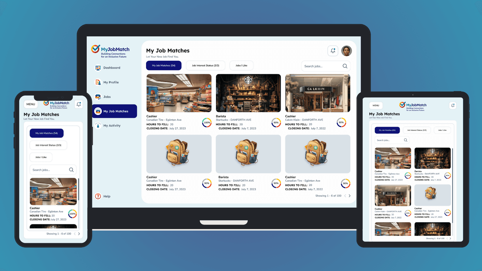
Job Matches View on mobile, desktop and tablet
User Flow for Expressing Interest in Jobs:
What I did: Designed a user flow that strategically places the Call-to-Action (CTA) for expressing interest in a job within the job detail page. This ensures users have read about the job before expressing interest.
Why:
Informed Decision Making: By placing the CTA within the job detail page, users are encouraged to make informed decisions based on a comprehensive understanding of the job details. This adheres to the UX principle of guiding users to make well-informed choices.
Balancing Freedom with Guidance: While users can "like" multiple jobs, limiting direct expressions of interest ensures a structured and focused approach, adhering to the UX principle of balancing user autonomy with structured guidance.
Result: A streamlined user flow that encourages informed decision-making and a balanced user experience.
Learnings: Designing with user intent ensures a more meaningful and efficient user experience. By guiding users through a structured flow while offering freedom, we can achieve a harmonious balance that benefits users and support providers.
Showcasing the user flow for expressing interest in jobs
Liked Jobs Feature:
What I did: Introduced the "Liked Jobs Feature" within the platform, allowing users to mark multiple jobs they're fond of but limiting direct expressions of interest to only three jobs until feedback is received from the employment support provider.
Why:
Efficiency and Prioritization: The feature ensures users can keep track of potential opportunities without overwhelming the support providers. It also ensures that users are genuinely interested in the roles they're pursuing, aligning with the UX principle of creating efficient and purposeful interactions.
User Autonomy: By allowing users to "like" multiple jobs, we respect their autonomy and preferences, adhering to the UX principle of giving users control and freedom within the platform.
Result: Enhanced the efficiency of the job placement process, ensuring users clearly distinguish between jobs they're fond of and those they're actively pursuing.
Learnings: Offering users a way to express their preferences while maintaining a structured approach ensures a more organized and efficient platform for all stakeholders.
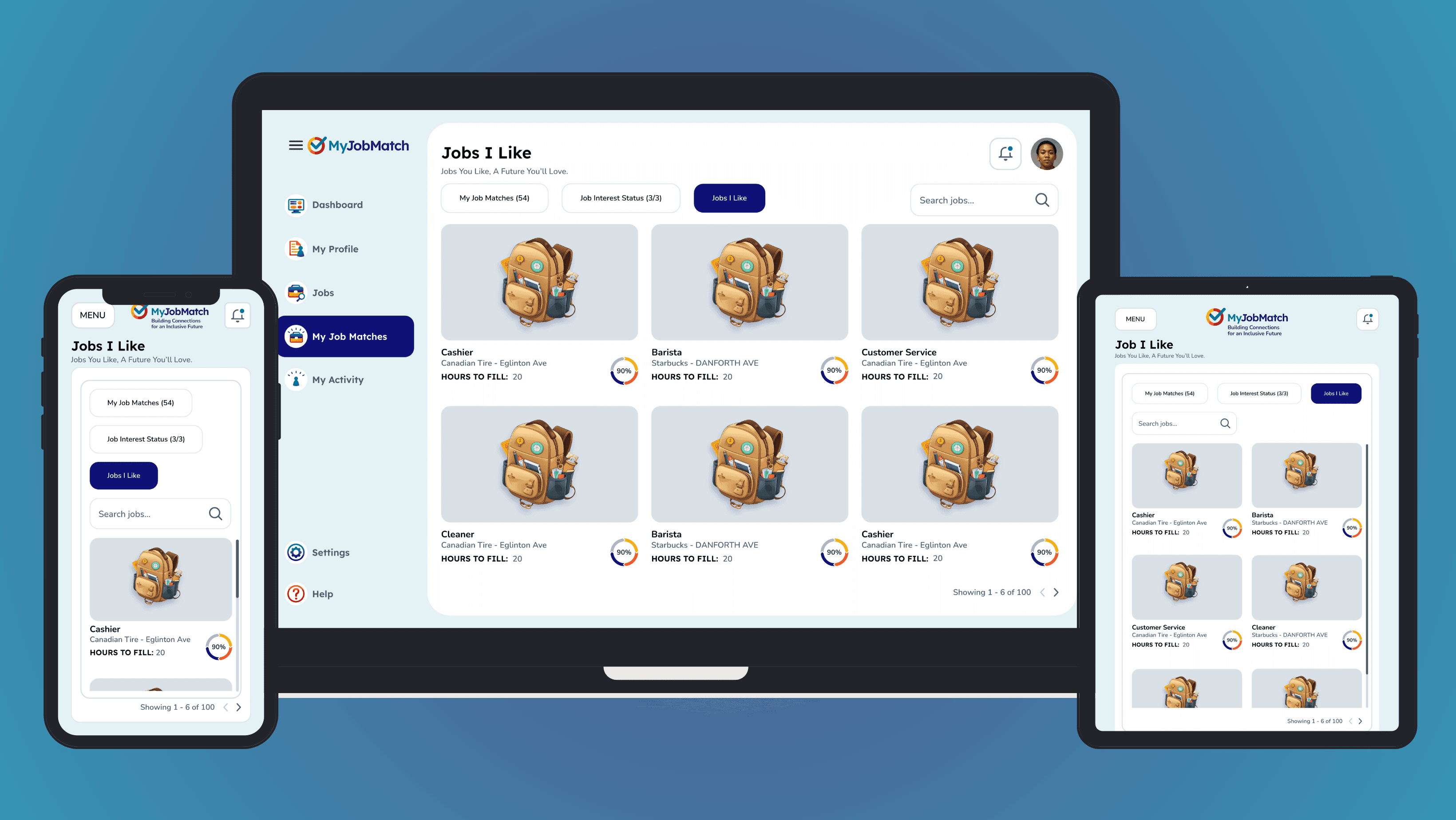
Showcasing the 'Liked Jobs' view on mobile, desktop and tablet
Activity Log Page:
What I did: Designed an activity log page to ensure users can track the history of their experience and activity on the platform.
Why: Providing users with a clear history of their interactions enhances transparency and trust.
Result: Users felt more in control and informed about their platform activities.
Learnings: Transparency in user actions fosters trust and encourages continued platform use.
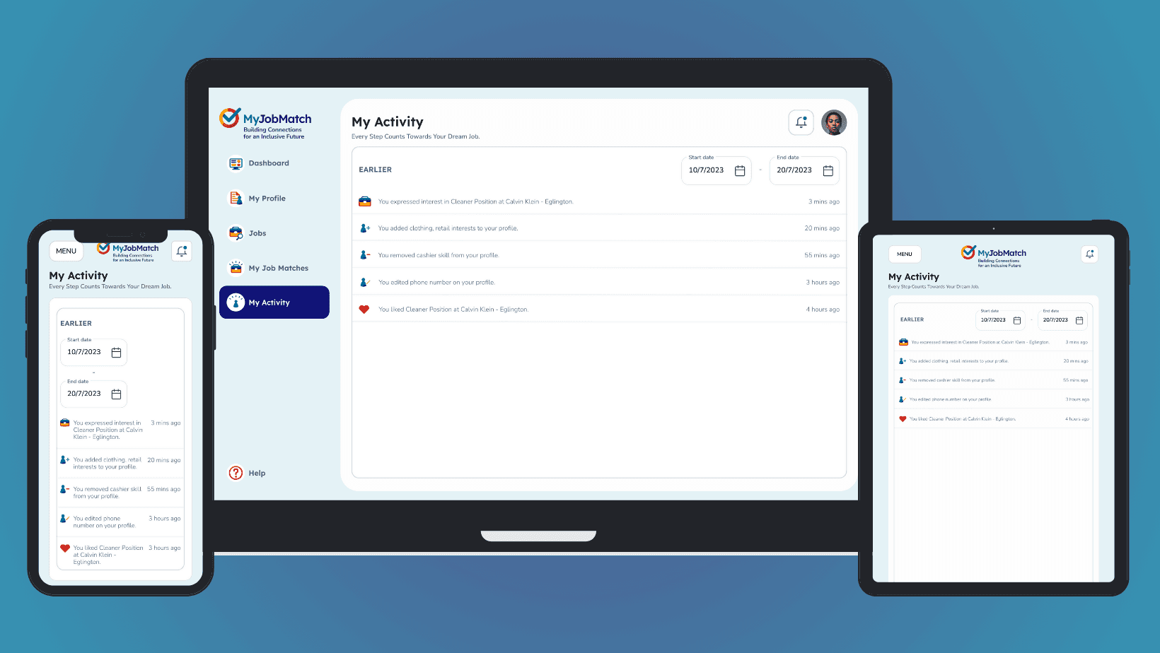
Showcasing the 'My Activity' view on mobile, desktop and tablet
Outcomes and Lessons Learned
Achievements:
User-Centric Approach: Successfully designed a platform that resonates deeply with its target audience.
Collaborative Design: Fostered strong relationships with stakeholders, ensuring the platform's alignment with broader community objectives.
Innovative Solutions: Introduced gamification and other solutions to address unique user needs.
Reflections
The journey of designing the MyJobMatch B2C platform was enlightening. It underscored the importance of user-centric design and the value of direct user feedback. The project also highlighted the power of collaboration, both within the team and with external stakeholders. The challenges faced, and the solutions devised have paved the way for a platform that promises to make a significant difference in the lives of its users.
Next Steps
The evolution of MyJobMatch continues further. Dive into the following case study to explore how the B2B and B2C platforms were seamlessly integrated, creating a holistic ecosystem that bridges the gap between employers and job seekers.