
Product Design of MyJobMatch B2B Platform
The Province of Ontario announced the phasing in of a new financial model for Employment Supports Services. The current Employment Supports Services does not receive traditional base funding but are funded through:
Employment Stats (finding someone a job)
Retention Stats (supporting them to stay at a job)
The new model only allows people working more than 20 hours/week to qualify as "employed." More than 50% of CLTO's supported employment participants work less than 20 hours/week, which means CLTO could lose significant funding for the Employment Supports department if they do not adjust how they work.
The primary goal was to design a custom job development platform to support Employment Supports Organizations to align, collaborate (with their team's members) and secure jobs (multiple roles or one role up to 20 hours) for job seekers to qualify as "employed."
I was entrusted with spearheading the UX and product design for the MyJobMatch B2B platform. This case study delves into my journey of transforming a complex problem into an intuitive, user-centric platform.
Government of Ontario
Community Living Toronto
Placemaking 4G
2022
Human Resources
Ontario, Canada
Challenge
The initial phase involved deep diving into the challenges faced by Employment Supports Organizations. I identified pain points, needs, and aspirations through stakeholder interviews, user surveys, and workshops. The primary challenges were:
Fragmented databases lead to inefficiencies.
Lack of real-time collaboration tools.
Difficulty in matching individuals with suitable job opportunities.
With a clear understanding of the problem, I set forth a vision for the platform:
"To create an intuitive, centralized platform that streamlines the process
for job seekers and employers, helping the Employment Support Providers identify and match aligned parties to opportunities, and consolidating some of the administration tasks
required to find and secure employment".
Roles & Responsibilities
Results
Post-launch, the platform saw daily usage for both database and administrative work. The reduced wait-to-hire rate and positive feedback from Employment Supports Providers were testaments to the platform's success. The recommendation conversion rate was a critical metric that showcased the platform's efficiency.
60%
Recommendation conversion rate
45%
Increase in job placements
40%
Reduction in the wait-to-hire rate
“You did an AMAZING job on these designs. You are so talented, Olu. I super appreciate your work (and speed) with this project.”

Kaylee Hake
Project Manager | Placemaking 4G
Scope & Constraints
While the vision for the MyJobMatch B2B platform was clear and ambitious, the journey to its realization was challenging. These anticipated and unforeseen constraints played a crucial role in shaping the design process and the final product.
Stakeholder Expectations: Collaborating with high-profile stakeholders like government officials and CLTO leadership meant managing expectations, ensuring timely feedback, and navigating bureaucratic processes.
Data Sensitivity: The platform dealt with sensitive user data, which required meticulous attention to data protection and privacy concerns.
Time Constraints: Given the ambitious nature of the project and the vastness of its scope, time was always of the essence, pushing the team to prioritize tasks and make strategic decisions on feature inclusions and exclusions.
In the face of these constraints, the MyJobMatch B2B platform emerged as a testament to the power of collaboration, adaptability, and a user-centric approach. These challenges refined my approach and deepened my understanding of the employment support landscape. Reflecting on this journey, I am reminded that constraints, often seen as limitations, can also be catalysts for innovation and growth.
Process & What I Did
Initial Research & Discovery:
What I did: To kick off the design process, I began with a series of stakeholder interviews with key stakeholders, including Employment Supports Organizations, Providers, and Secondary Users.
Why: Engaging stakeholders early ensures the product aligns with business goals and user needs. It's a foundational UX principle to gather insights from those who have a vested interest in the product.
Result: A clearer understanding of the platform's objectives, constraints, and potential challenges. Key insights included the need for collaboration, an intuitive recommendation system, and a centralized database.
Learnings: The significance of aligning design decisions with business objectives and users' needs to ensure a successful product outcome.
User Personas:
What I did: Developed personas for Employment Supports Organizations, Providers, and Secondary Users to guide the design process.
Why: Understanding our users is a fundamental UX principle. By creating detailed personas, I could ensure the platform was tailored to our target audience's needs, behaviours, and concerns.
Result: A more precise direction in design decisions, ensuring the platform resonated with its intended users.
Learnings: The importance of grounding every design decision in deeply understanding the user. This ensures that the product is not only functional but also user-centric.
User Personas Document Developed :
Creation of User Scenarios from Personas:
What I did: Collaborated with the product manager to develop detailed user scenarios based on the established personas, ensuring each scenario represented a specific context or situation a user might encounter.
Why: User scenarios provide a narrative describing how users might interact with the product in real-time. This foundational UX principle ensures the design process is rooted in realistic user contexts.
Result: A comprehensive set of user scenarios that provide a deeper understanding of user behaviours, needs, and contexts.
Learnings: Recognized the importance of visualizing the user's journey and interactions with the product. Realized that scenarios are instrumental in anticipating user needs and challenges.
Translating User Scenarios into User Goals:
What I did: Transformed each user scenario into a clear user goal. For instance, the scenario "Greg, an organization head, wants to centralize his company's data" became the user goal "Enable organization heads to centralize data."
Why: By translating scenarios into goals, we can pinpoint the core objectives users aim to achieve. This UX approach ensures the design remains focused on fulfilling specific user objectives and needs.
Result: Clear, actionable user goals derived from realistic user scenarios.
Learnings: Understood the value of specificity in guiding the design process. Recognized that clear user goals lead to more targeted and effective design decisions.
Feature Creation Based on User Goals:
What I did: Using the defined user goals, I conceptualized features that would fulfill these goals. For the goal of "Enabling organization heads to centralize data," the feature became "Account and Database Creation with Centralized Data Management."
Why: Converting user goals into tangible features ensures that the platform's functionalities directly address user needs. This core UX principle ensures that the product remains user-centric and provides real value.
Result: A list of features designed to fulfill a specific user goal, ensuring the platform is comprehensive and user-focused.
Learnings: Recognized the importance of a systematic approach to feature creation. Learned that by grounding features in user goals, we ensure that the product remains relevant and valuable to its target audience.
Information Architecture:
What I did: Based on the research findings, I identified primary tasks users aim to achieve and grouped related content together based on these tasks.
Why: Grouping content based on user tasks ensures that the IA is organized around user needs and behaviors. This is a foundational UX principle that ensures users can intuitively navigate and find the information they're looking for.
Result: A structured and logical content map that provides a clear path for users to navigate through the platform.
Learnings: Understood the importance of organizing content from the user's perspective. Recognized that user-centric groupings lead to more intuitive navigation.
Wireframing:
What I did: Created low-fidelity wireframes to map out the user journey and platform layout, iteratively refining them based on user feedback.
Why: Wireframing is a crucial step in the UX process. It allows for rapid iteration and testing of layout and flow before diving into detailed design.
Result: A visual blueprint of the platform's structure and functionality, which guided further design and development.
Learnings: The value of visualizing ideas early on and iterating based on feedback, ensuring a solid foundation for the subsequent design stages.
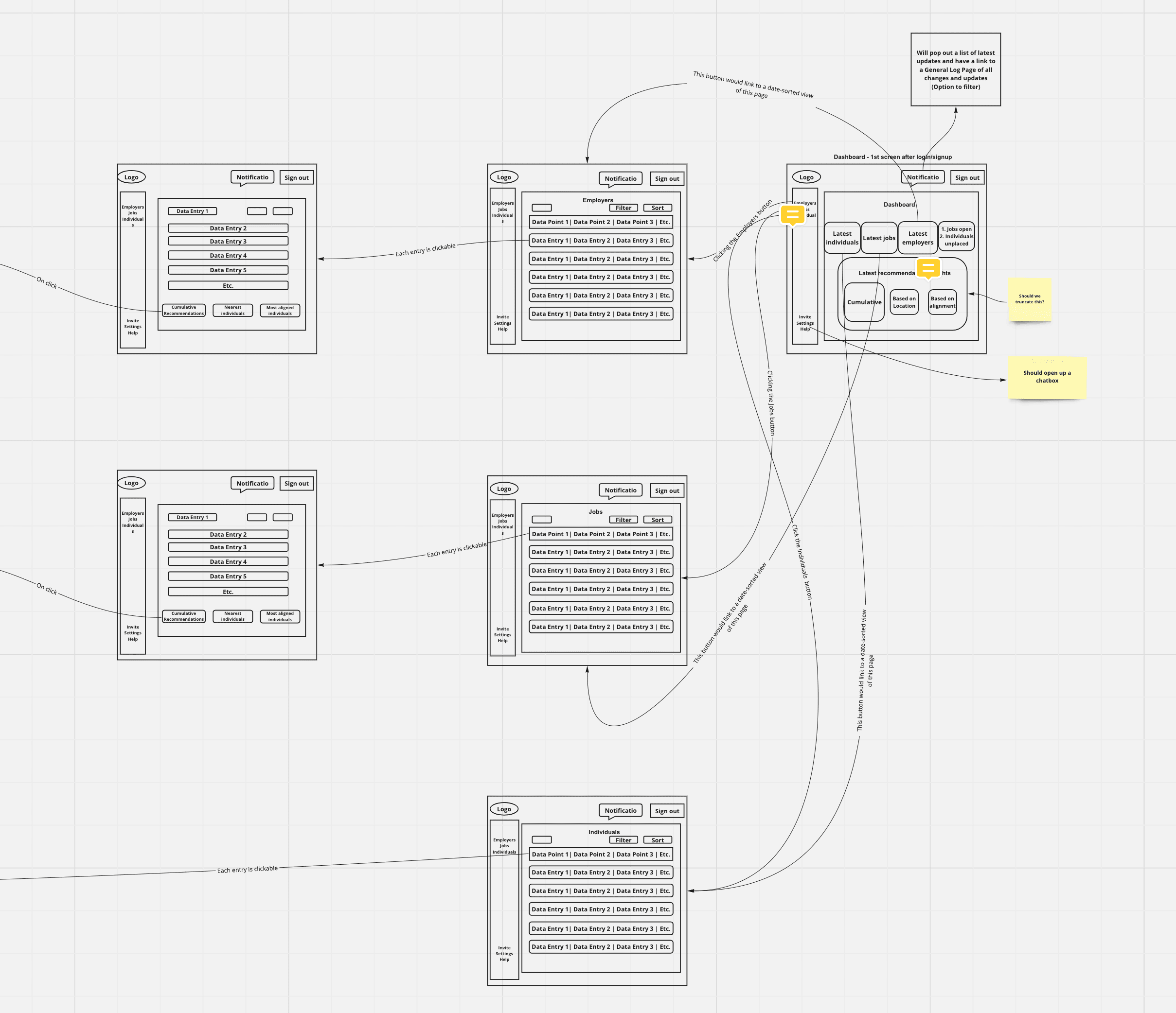
Low-fiidelity wireframes on miro board
Prototyping:
What I did: Developed high-fidelity prototypes, focusing on user-centric design principles.
Why: Prototyping brings designs to life, allowing stakeholders and users to interact with a mock version of the product. This step is essential for gathering feedback and ensuring the design aligns with user expectations.
Result: A tangible representation of the final product that underwent multiple iterations based on user feedback.
Learnings: The importance of iterative design and the value of user feedback in refining and perfecting the user experience.
User Testing & Iteration:
What I did: Conducted usability tests with potential users, gathering feedback and iterating on the design.
Why: User testing is a cornerstone of UX design. It ensures that the product not only looks good but also functions well and meets user needs.
Result: Valuable insights into areas of improvement, leading to a more refined and user-friendly platform.
Learnings: The significance of real-world testing and the need to be adaptable and responsive to user feedback.
Design to Developer Handover Process:
What I did: I finalized and exported all design assets to Zeplin, ensuring they were consistent and accurately represented. I maintained open communication with the development team, addressing queries and providing iterative feedback. Alongside Zeplin exports, I provided comprehensive documentation to guide the developers.
Why: The goal was to ensure a smooth transition from design to development, emphasizing clarity, efficiency, and collaboration. Using tools like Zeplin streamlined the process, while open communication ensured the final product remained true to the design vision. Detailed documentation further clarified design intentions and expected behaviours.
Result: The seamless handover resulted in a product that closely mirrored the design vision. The collaboration between design and development was enhanced, ensuring design fidelity and easy access to all necessary assets and guidelines.
Learnings: The process underscored the importance of thorough design reviews, proactive discussions, and the value of tools like Zeplin. It also highlighted the significance of detailed documentation in guiding the development process.
Key Design Decisions
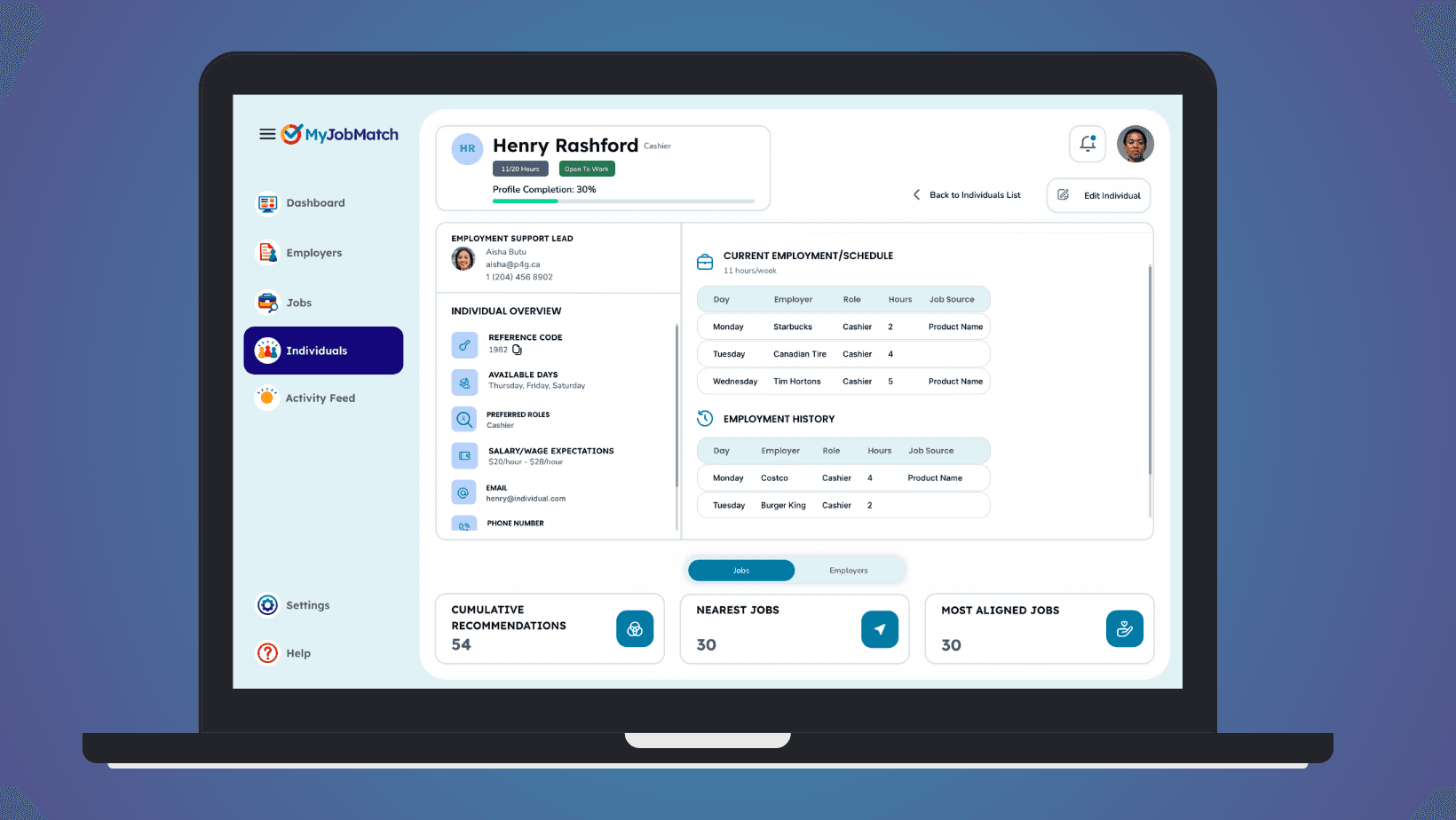
Dashboard Design:
What I did: Created a comprehensive dashboard that provided employment support providers with a snapshot of key metrics and activities.
Why: A well-designed dashboard, grounded in UX principles, can provide users with quick access to essential information, improving efficiency and user satisfaction.
Result: Employment support providers had a clear overview of their activities and metrics, leading to increased platform engagement.
Learnings: The power of effective information presentation and the importance of prioritizing user needs in design decisions.
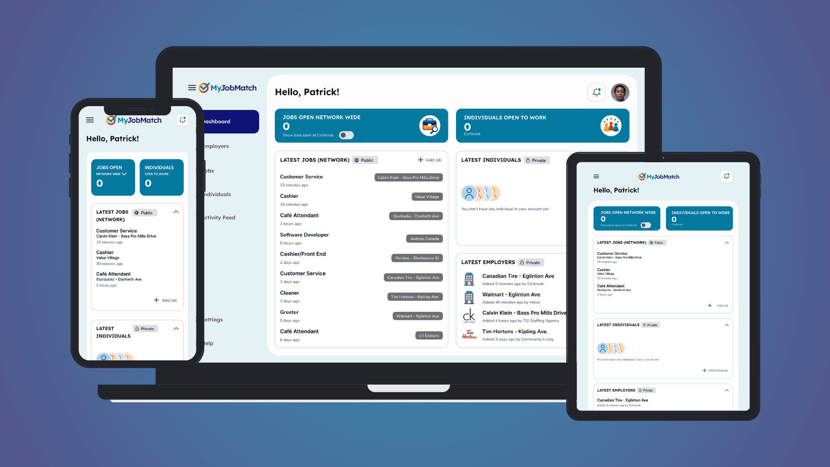
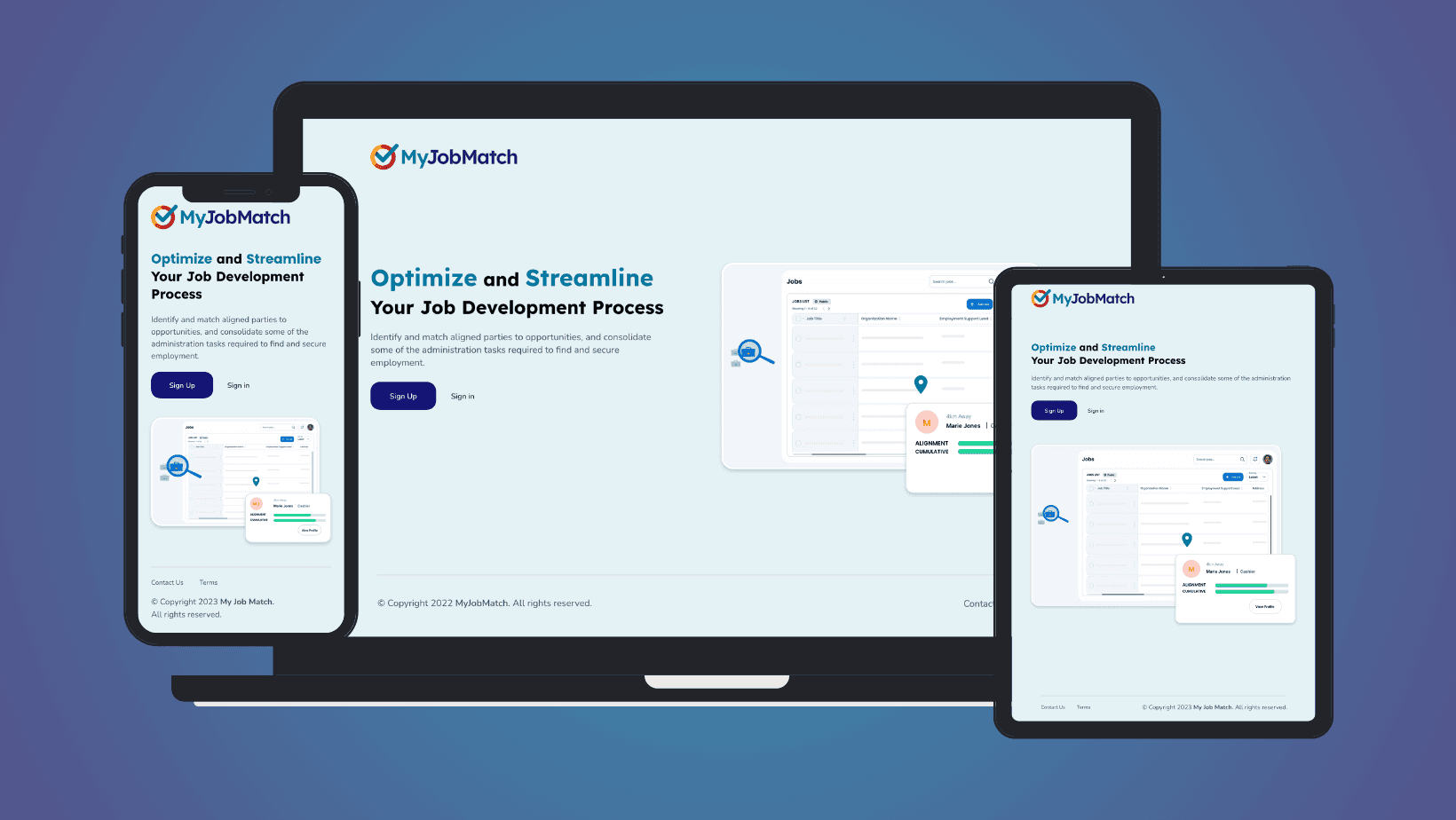
Dashboard design on mobile, desktop and tablet
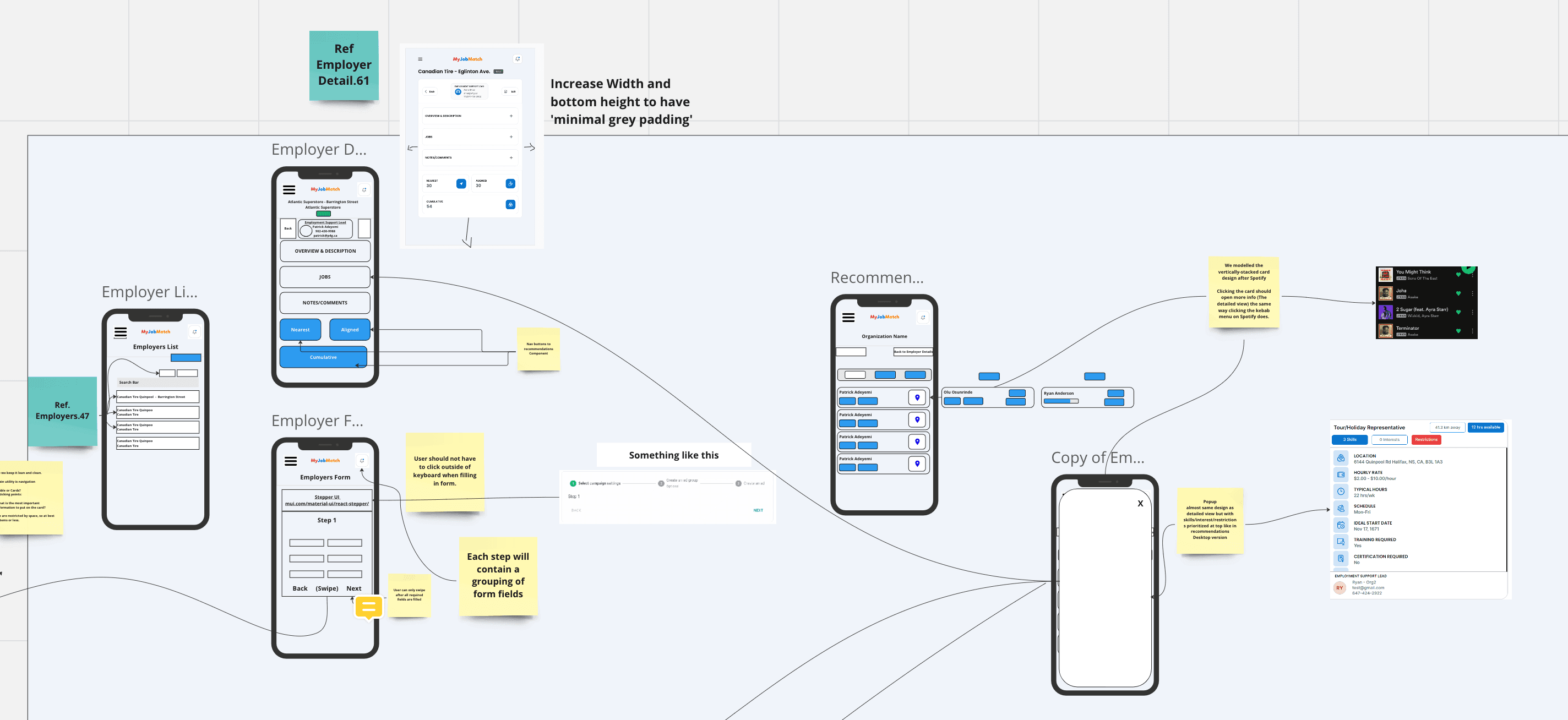
Form Design for Data-Driven Recommendations:
What I did: I meticulously crafted forms to capture the nuanced details of jobs, individual profiles, and employers. Recognizing the symbiotic relationship between form inputs and recommendation outputs, I ensured these forms gathered the precise data points necessary for our matching algorithms.
Why: Accurate recommendations hinge on the quality of data input. By designing intuitive and comprehensive forms, I aimed to streamline the data collection process, ensuring the recommendation system had a robust foundation to operate from.
Result: The forms facilitated the collection of rich, actionable data, which powered a recommendation system that provided users with highly relevant job matches. This led to an uptick in user satisfaction and successful job placements.
Learnings: The design of input mechanisms, like forms, plays a pivotal role in the success of data-driven systems. A well-structured form can be the linchpin in ensuring the system's outputs are accurate and valuable to the user.
Showcasing the form experience that powers the job recommendation feature
Tri-Faceted Recommendation System:
What I did: I architected a recommendation system with three distinct matching algorithms. The location-based algorithm used geographical data, the job alignment algorithm considered skills and interests, and the cumulative algorithm synthesized these data points for a holistic match.
Why: A multi-dimensional approach was essential to cater to the diverse needs and preferences of our individuals and employers. By integrating multiple algorithms, the system could offer a broader array of matches, each tailored to different individual and job priorities.
Result: Employment support providers were presented with job recommendations that resonated with individuals' personal and professional aspirations. The system's ability to offer geographically convenient and skill-aligned job suggestions led to increased user engagement and successful job matches.
Learnings: Diversity in recommendation logic can significantly enhance user experience. A system can offer more personalized and impactful recommendations by considering a spectrum of user preferences.
Showcasing the user experience of the recommendation system
Outcomes and Lessons Learned
Achievements:
Enhanced Collaboration: The B2B platform successfully bridged the gap between employment support organizations, creating a cohesive ecosystem that prioritized the needs of job seekers with disabilities.
Data-Driven Insights: The platform's robust analytics tools enabled organizations to harness the power of data, leading to more informed and effective decision-making processes.
Operational Efficiency: The platform's streamlined processes and centralized resources significantly boosted the efficiency of organizations, resulting in faster job placements and heightened user satisfaction.
Reflections
The Power of Feedback: Engaging continuously with stakeholders and users was enlightening. Their feedback was instrumental in shaping the platform, underscoring the importance of user-centric design.
Adaptability in Design: The design journey highlighted the importance of flexibility. In the ever-evolving B2B landscape, being open to change and iteration was essential.
Prioritizing Simplicity: The design process reinforced the notion that less is often more. While feature-rich platforms can be tempting, clarity and simplicity ensure a more intuitive user experience.
The Importance of Data Integrity: The platform's recommendation system's success was closely tied to the quality of data input. This emphasized the need for well-designed input mechanisms to ensure data accuracy.
Through the intricate journey of developing the MyJobMatch B2B platform, we've witnessed the transformative power of user-driven design and strategic collaboration. The platform's achievements underscore the importance of aligning technology with real-world needs, ensuring that every feature and function serves a purpose. As we celebrate these successes, I recognize that innovation is an ongoing process.
With lessons learned and insights gained, we're excited to embark on the next chapter: the B2C iteration of MyJobMatch. I invite you to delve into this next phase, where we further bridge the gap between job seekers with disabilities and meaningful employment opportunities.
